Back to Projects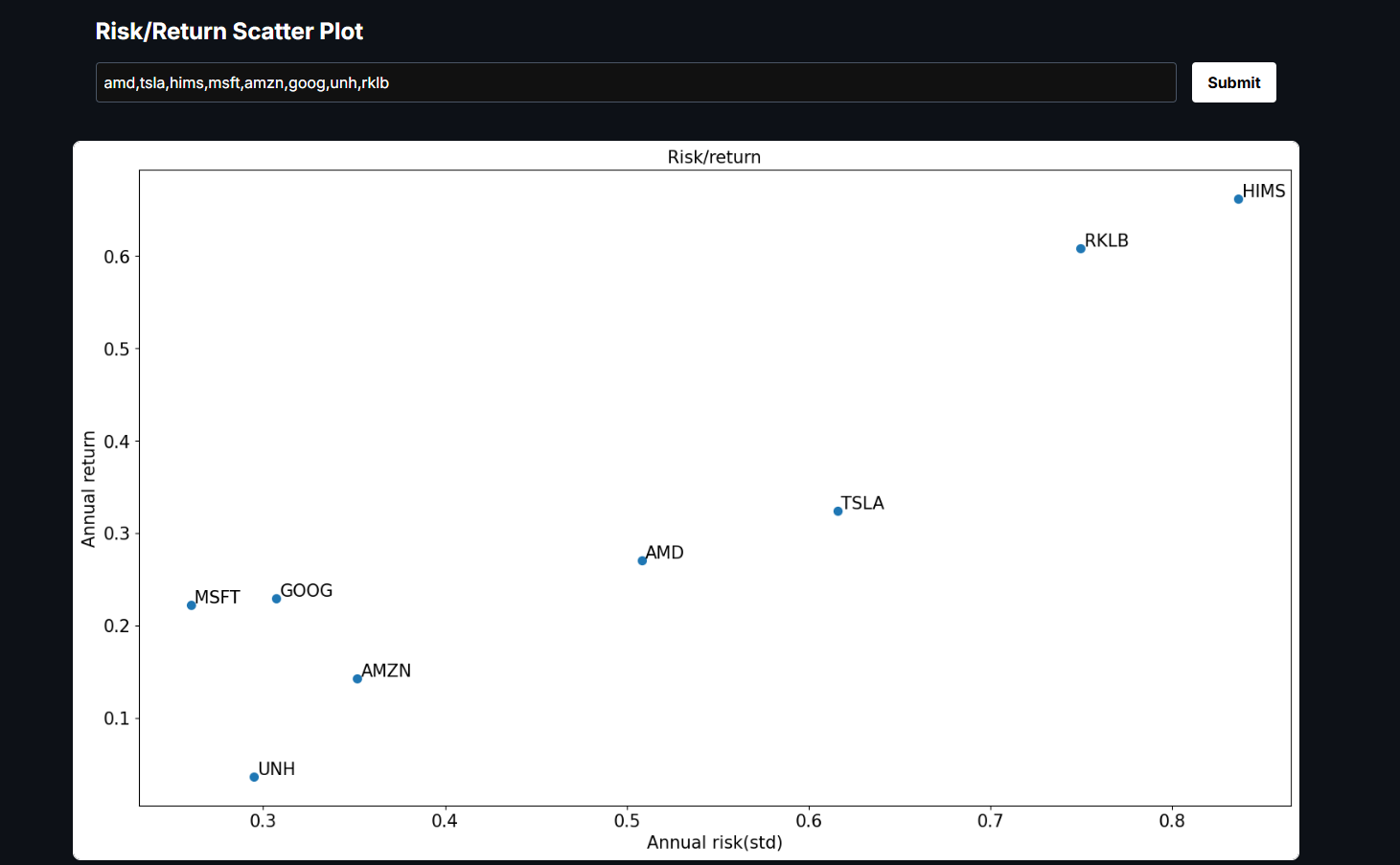
Risk/Return for Stocks in Scatter Plot
PythonFlaskReactTypeScriptyFinance
About
This project is a quantitative finance visualization that compares the risk–return profiles of multiple stocks. It retrieves historical price data from Yahoo Finance, computes daily returns, and annualizes them into expected return and volatility metrics. Each stock is then plotted on a scatter chart, making it easy to see which assets deliver higher returns relative to their risk and to evaluate diversification opportunities. On the backend, a Python service built with pandas, NumPy, yfinance, and matplotlib performs the calculations and generates the chart, which is returned as a base64-encoded image. The frontend, powered by Next.js, communicates with this Python script through an API route that spawns a child process, validates user input, and streams back clean JSON. This design keeps the system lightweight, stateless, and portable while combining the strengths of Python’s data analysis stack with modern React-based web development.
Gallery